Perspective is all about looking at something in a certain angle. In art, there are many types of perspectives, such as forced, localized, linear, and anamorphic. Therefore, there is not one certain were art is to be seen.
In the early stages, on my project, I became intrigued with the idea of forced perspective, mainly due to watching the Lord of the Rings video. In the making of Lord of the Rings, director Peter Jackson uses forced perspective in order to create illusions between the character's heights. Since this is a fantasy film, this element is extremely important because the character's heights range between four to seven feet. With proper placement, exact cinematography, and small props, Jackson was able to successfully produce the hobbit's world,
Subsequent to watching this video, I began to really be intrigued to linear perspective because I wanted to experiment drawing straight lines from different angles. I want to slowly add in each point as I get deeper into my project. Once I had chosen linear perspective, I brainstormed what my actualy artwork should be; architecture, train tracks, etc. Then, I created a pinterest page detailing the different types of perspective I could play around with.
My Planning Process
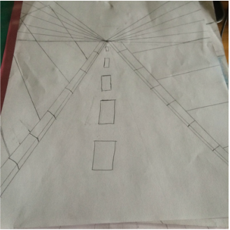
My first sketch for linear perspective. My initial plan was to draw a road with buildings surrounding it, like a city.
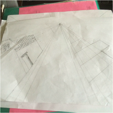
Going with my European theme, I began to research images of villas, because I found them to be lovely and full of intricate details.
|
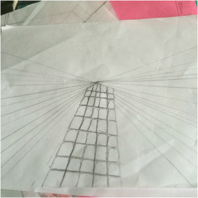
After my first try, I wanted to try to focus on drawing the city buildings, because I felt that I did not cover all of the angles.
I know that I went insane with my lines, but I wanted to play around with my building heights.
|
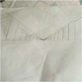
In this plan picture, my mind began to drift toward Europe and its beautiful cobblestone streets. I then disregarded the whole road idea in favor of cobblestone.
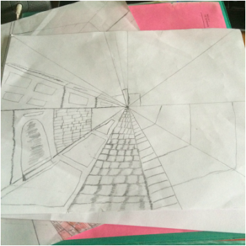
Although I found cobblestone to the center focus of my project, I finally decided to drawing a river, because I was inspired by the streets of Venice.
|
My Artwork Process

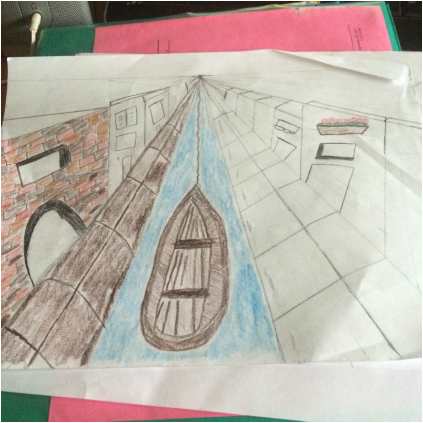
This was the first stage of my test run. Surprising enough, my sketch was not as atrocious as I thought it would be. The lines were not uneven, and the boat actually resembled a boat. My next plan was to begin to draw in my details, such as the bricks of my buildings. I felt excited at all of the buildings I could incorporate into this drawing. Since I had more space, I could draw in more places and details. But at that point, I was just happy that my paper wasn't covered in eraser-pencil residue. I wasn't sure if colored pencils could cover all of the flaws that I would soon encounter, once I began to draw more complex buildings.

This is stage two of my project. I'm starting to get the feel of things, but I still need to add more details. I felt that adding in building toward the horizon line would not be the very nice-looking, so I decided to add a bridge because Venice is full of bridges, right? It's killing two birds with one stone. Also, I still got to draw in stones that I did not do for my cobblestone streets. Also, I added in a church and cafe because it wouldn't be Italy without a church or a cafe, serving out espressos. I guess I was unconsciously displaying my interest in Italian culture.

This was one of my favorite parts of the project; coloring the picture in. But I was afraid that the image might not look like the artist vision I had in mind. I wanted a vibrant portrayal of Italy, and I hoped that colored pencils could suffice. I also wanted to choose watercolor or oil pastels, but I felt that it would be too messy for me. I'm not exactly the neatest artist in the world, and the sharpened tip of colored pencils give me a better chance of not going over the lines. Actually, using colored pencils reminded me fondly of my childhood days, because I used them a lot during that time.

This is my final product, in all of its colorful and pencil-filled glory. I tried my best to incorporate colors wherever I could, mostly with the brick building, which I used four different colors. It was a long and consuming task, but I am pleased with the outcome. I wanted to add in pastels to the church, in order to give the place a light and airy appearance. I hoped that the colors gave each building their respective characteristics, and their beauty. In the end, I just want to communicate to people that Italy and Europe in general is a beautiful place, full of history and colors. I found inspriation in Italy, and I've come to apperciate the country far more.
