Printmaking

Recently, we have begun with the a new art unit, which is primarily about printmaking. So far, Michelle has taught us two types of prints- monoprinting and styrofoam printing. The former uses a tray in order to produce prints, where the image is painting on. The latter relies more on a paper plate, where the shape can me manipulated and the image is carved into it. Nevertheless, both forms are incredibly interesting to play around with, but I do need a bit more experience with mastering my printmaking.
At this point, I feel that I am a bit more partial to mono printing, because it feels like it has a smoother format to work with. As an artist, I do not consider myself as an incredibly neat and meticulous worker, and I am prone to making mistakes from time to time, such as coloring over a line to being slightly off with my drawing scale. When it came to styrofoam printing, I found it to be somewhat hard to carve in an image, because messing up the line of which I was tracing was likely to happen, because the texture of styrofoam is very rigid.
For my first print, I just did a brief set of squiggles on the printing tray. Since I was running out of time, I did not really get the chance to make a ghost copy, which I wish I had done. The same conflict happened to me with my styrofoam print as well, since I had to spend more time carving in my image, which was a sailboat at sea. When I was carving it, I did make a minor mistake, which was a line that I accidentally carved into too far, which made my sailboat a bit unproportional. Perhaps this was because of the carving tool I used, which was alternating between the end of a pair of scissors and a pencil. Nevertheless, I did have fun with this, because it did allow me to experiment with a different medium for printmaking.
Therefore, for this project, I will choose to focus more on styrofoam printing, in spite of my difficulty with it. I did like the circular design of it, and how vividly the image does pop out when it made. Maybe it was the lack of time I had this week (I had to leave in the middle of one class to fill out some forms), which hindered my full capacity to successfully a produce a styrofoam print. Thus, I do feel that I should challenge myself in art class, this is the place to start.

The Process
Beginning Stage
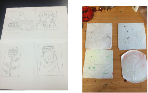
The first step of my process was to design my four styrofoam prints. For my first two prints, I focused to choose on some iconic film shots, such as the ending of Casablanca and the poster of Lawrence of Arabia, which are both some of my personal favorites. I felt that the whole noir/black and white scheme was an easier method to achieve a minimalist design. I did not want to create any sort of print that was too complicated because I was working under time constraints. I felt that I still could cultivate an intricate print with a minimalist use of lines.
As for my two other prints, I focused on my favorite topics in art- nature. For my first one, I chose to do a flower and experiment with a minimalist amount of two petals and four leaves. Furthermore, I tried to enhance this design by adding lines to the petals and leaves, in order to add some depth to it. In the second nature print, I utilized contour lines, in order to make my drawing appear a bit more realistic. I based this design off of European landscapes, because I love to center my art projects around them.
After I complete all four of my designs, I took some tracing paper and traced the design from each of the drawings onto it. Then, I took another pencil and traced these designs directly onto the stryofoam, in order to ensure that they would be precise for the most part. In order to cement my designs onto the stryofoam, I retraced all of the lines.
Printing Stage

The first print I worked with was my contour landscape one. Since I wanted to build up my skill for it, I decided to only work with one color for this one. This one, by far, was one of the more easier prints, and I feel like I can accredit this to the fact that I utilized contour lines in my landscape. Also, I retraced the lines in the print, in order to make it deeper and thicker. This method proved well especially for the landscape print, because all of the figures were accentuated in my design.
As for my flower print, I attempted to be a bit more adventurous with the colors, choosing to blend red and green in order to add a bit of creativity with the print. I decided to paint the red and green next to each other, and used my brayer to cover the print in the two colors. By moving left and right horizontally, I was then able to achieve the blended look.
As for my flower print, I attempted to be a bit more adventurous with the colors, choosing to blend red and green in order to add a bit of creativity with the print. I decided to paint the red and green next to each other, and used my brayer to cover the print in the two colors. By moving left and right horizontally, I was then able to achieve the blended look.

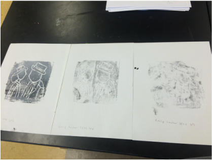
My next series of my print were with my Lawrence of Arabia ones, which was my personal favorite, design wise. In spite of being my personal favorite, I felt that this was one of my lesser quality prints. Initially, I had attempted to do a blending of light and dark blue, which I achieved by blending vary amounts of white with blue.
Although these colors looked lovely on my mixer, when I actually implemented them, they appear to be only one shade of blue. Looking back, I perhaps could have worked to blend more distincter colors, as I did with my flower print.
Although these colors looked lovely on my mixer, when I actually implemented them, they appear to be only one shade of blue. Looking back, I perhaps could have worked to blend more distincter colors, as I did with my flower print.
My next series of prints were my Casablanca ones. In order to emulate the black and white cinematography of the film, I tried to blend black and white in order to produce varying shades of gray.
Unfortunately, as my Lawrence of Arabia prints, I'm afraid that my blending was not as distinct as I thought it would be. Instead, I produced just one shade of dark grey. At least the design of my print came out easily.
Unfortunately, as my Lawrence of Arabia prints, I'm afraid that my blending was not as distinct as I thought it would be. Instead, I produced just one shade of dark grey. At least the design of my print came out easily.

For my final series of prints, I decided to choose a different background, which was one of the black papers. I chose neon colors for this print, and I did like the way it appeared on paper, because it had a distinct blend. However, since I did use the Casablanca print a number of times before, I noticed that this print appear to be somewhat faded.
I had also chosen to do white, but due to the circumstances of the styrofoam, it did not print as well as I wanted it to be. Therefore, if I could change one thing about this specific process, it would be planning out the colors i would be using for each of the prints, so I would not waste them away print after print.
I had also chosen to do white, but due to the circumstances of the styrofoam, it did not print as well as I wanted it to be. Therefore, if I could change one thing about this specific process, it would be planning out the colors i would be using for each of the prints, so I would not waste them away print after print.
Reflection
Overall, I had an amazing time with this project and I enjoyed every minute. I liked the fact that I stepped outside of my comfort zone to play around with a different medium. Pacing wise, I felt that I had enough time to produce a quality amount of prints.
One thing I could have done differently is experiment with more colors. I should have chosen more distinct shades of blue and gray, in order to convey these colors on my prints. However, when I did blend two opposite colors, I did find it to work well in my final designs. Therefore, I think that the aspect of this project that I do have to work on next time is just focusing on the colors, and how they will appear on the paper.
Aside from this, I also was nervous about transferring my prints, because I did not want them to be inaccurate when it came time for printing. Nevertheless, with my tracing paper technique, they all appear the same, to my relief.
